
Highlights
- Muted Titanium Palette: Galaxy S26 Ultra launches in four primary colors Titanium Gray, Black, Violet, and White all within a subdued grayscale range.
- Lack of Emotional Color Appeal: No bold or emotionally resonant hues like Apple’s Orange Titanium, which boosted visual identity for iPhone 15 Pro.
- No Distinctive Flagship Color: Samsung skips any standout or signature color, missing an opportunity for visual branding.
- User Demand for Vibrant Options Ignored: Gen Z and creative users favor expressive colors Samsung failed to target this intent.
- Material-Color Conflict: Titanium’s low reflectivity dulls any potential saturation, limiting bright or vivid tones unless new treatments are adopted.
- No Color-led Storytelling in Launch Strategy: Unlike competitors, Samsung’s launch lacks a strong narrative or lifestyle appeal tied to color.
- Online Exclusive Variants May Offer Relief: Potential for web-only Blue, Green, or Red variants, though these have limited visibility and impact.
- Samsung Trails Rivals in Color Innovation: OnePlus, Xiaomi, and Apple all push bolder, emotionally-driven hues in premium devices.
- Design Direction Shift: Samsung shifts from experimental (Aura Glow, Mystic Bronze) to minimalism possibly reducing brand distinctiveness.
- Color Psychology Overlooked: Warm and energizing tones like orange drive impulse buying and product recall, yet are completely absent.
Why Does the Galaxy S26 Ultra Color Lineup Lack Vibrancy Compared to Competing Flagships?
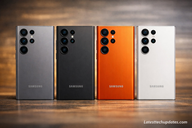
Samsung Galaxy S26 Ultra’s official color lineup consists of muted tones, including Titanium Gray, Titanium Black, Titanium Violet, and Titanium White. These standard options lack expressive or emotionally evocative hues, which are typically utilized in flagship devices to enhance desirability and personal expression. In contrast, Apple introduced a distinctive Orange Titanium variant in its iPhone 15 Pro lineup, demonstrating bold color engineering tied to premium positioning.
What Are the Core Color Choices for the Galaxy S26 Ultra?
Samsung selected Titanium Gray, Titanium Black, Titanium Violet, and Titanium White as the main retail colors. Each of these falls under neutral or desaturated color profiles, targeting a corporate or minimalistic aesthetic. The material surface finish uses a brushed titanium design, which further mutes the visual saturation of these color variants.
How Does Apple’s iPhone Color Strategy Outperform Samsung’s?
Apple’s iPhone 15 Pro line included an Orange Titanium model that stimulated emotional purchase triggers by leveraging warm color psychology. Orange symbolizes enthusiasm and creativity, increasing user attachment and product memorability. Apple’s color strategy aligns with brand personality, using emotionally resonant hues as both design and marketing leverage. Samsung’s absence of such emotionally-charged colors weakens visual shelf impact.
What Impact Does Color Play in Smartphone Consumer Decisions?
Color is a major emotional and aesthetic trigger in high-end smartphone selection. Vivid or rare colors like coral, red, or orange stimulate impulse buying, increase brand distinctiveness, and enhance user-device identification. Consumers often equate bold colors with innovation and personality. Neutral-only palettes, while safe, lack the ability to differentiate at first glance, especially in saturated premium markets.
Could Exclusive Online Colors Help Samsung Salvage Consumer Interest?
Samsung is expected to release additional color variants via its online store likely including Blue, Green, and possibly Red. Historically, Samsung’s web-exclusive colors served niche segments but lacked retail visibility. Introducing a bold flagship color such as Amber Orange or Copper Red could reinvigorate interest and create differentiation across marketing channels, especially if tied to seasonal or regional exclusivity.
How Does the S26 Ultra Color Choice Reflect Broader Samsung Design Strategy?
Samsung’s industrial design team appears to be focusing on timeless minimalism for the S26 Ultra, rather than seasonal or expressive trends. The Titanium finish aligns with the premium material trend seen across Apple and OnePlus, indicating a hardware-first narrative rather than emotional product design language.
What Role Does Material Selection Play in Perceived Color Quality?
Titanium as a base material diffuses light differently than aluminum or glass, resulting in flatter color reflections. Even vibrant pigments appear subdued due to titanium’s low reflectivity and grainy surface. This limits Samsung’s ability to offer glossy or iridescent finishes without significant changes to material coatings or treatments.
Is Samsung Sacrificing Brand Identity for Apple Mimicry?
The neutral color set mirrors Apple’s conservative palette of Black Titanium, White Titanium, and Blue. However, Samsung has traditionally been more experimental with its Aura Glow and Mystic Bronze finishes in prior Galaxy generations. Moving toward grayscale tones signals a retreat from that adventurous branding, which could dilute its unique design language.
How Do Competitors Like Xiaomi and OnePlus Use Color for Differentiation?
Xiaomi 14 Pro and OnePlus 12 both offer bold hues like Glacial Green, Sandstone Red, and Vegan Leather options. These create visual and tactile appeal that supports product storytelling. Samsung’s color inexpressiveness makes the S26 Ultra feel utilitarian rather than aspirational, which impacts emotional branding potential.
What Are the Cultural and Regional Influences on Color Preferences?
In emerging markets like India and Southeast Asia, bold colors often outperform neutral tones due to cultural associations with vibrancy and prosperity. Samsung’s reliance on muted palettes could underperform in these segments, especially among younger demographics seeking expression and personalization through color.
What Does the Future Hold for Galaxy Flagship Color Strategies?
Samsung is likely to recalibrate its design philosophy in response to lukewarm reception of conservative palettes. Consumer feedback, especially from Gen Z and millennial segments, could push for more dynamic finishes in mid-cycle releases or special editions.
Could Collaborations Unlock Better Color Variants?
Strategic collaborations with fashion brands, pop culture franchises, or regional artists could yield limited-edition colors that reinject freshness into the product lifecycle. Examples include Thom Browne Editions or Olympic-themed variants in previous Galaxy Fold series, which resonated strongly with niche markets.
How Will Color Innovation Affect Future Samsung Marketing?
Color-centric campaigns tied to events like seasonal changes or movie releaszes could position color as a narrative focal point. By elevating color to a storytelling medium rather than just an aesthetic choice, Samsung could rebuild visual desirability around its Ultra models.
Are There Technological Barriers to Brighter Colors on Titanium?
Titanium’s natural dullness limits high-saturation finishes unless layered with ceramic coatings, PVD treatments, or glass composites. Adopting such methods would require reengineering part of Samsung’s supply chain and potentially impact thermal dynamics or device weight.
What Lessons Can Be Learned from the S26 Ultra Color Reception?
The muted response to S26 Ultra’s color palette reveals a gap between industrial design intent and consumer emotional engagement. Bold flagship color variants not only serve as marketing assets but also define device personality and visual recall. Avoiding this design lever leaves Samsung at risk of falling behind in lifestyle branding, especially as smartphone differentiation increasingly hinges on experiential attributes.
Conclusion
The Galaxy S26 Ultra’s conservative color lineup fails to capitalize on the emotional and marketing power of vibrant design. As competitors embrace boldness through both form and hue, Samsung risks visual irrelevance unless future iterations reintegrate expressive colors and regional customization into their flagship DNA.